Wednesday, April 8, 2020

Ending Corona Lockdowns


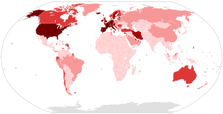
Spread of Corona Virus as of 7 April

While it is still early, we need to think ahead about ways to end lockdowns assuming we cannot totally eradicate the disease.

Remember there is no vaccine against AIDS and it has been with us for about 40 years. We cannot be sure that we will have a safe reliable vaccine for Covid 19 in 12 or 18 months. We cannot stay in lockdown for years. Lockdown will likely start to break down after 3 to 6 months for a variety of reasons, social, economic and psychological.

But there is a strategy for getting out of lockdown and self isolation with minimum deaths based on mortality rates by age group. 

Based on Australian data:
No deaths out of 1600 cases in the 20–29 age group
No deaths out of 830 cases in the 30–39 age group
No deaths out of 700 cases in the 40–49 age group
1 death out of 820 cases in the 50 to 59 age group

Australian Government modelling released 7 April shows very low hospitalisation and intensive care rates for people under 50, particularly for those under 30 (based on analysis of over 5000 cases)

I have not examined the younger age groups as the case numbers are too low to have much confidence in extrapolating the results from them at this time, but that is perhaps a great indicator of low transmission rates to young people or lack of health problems among them when infected such that few are being tested.

From those mortality numbers above we can see that the risk of death in these age groups is virtually zero provided the very sick of those infected have access to treatment including ventilators and provided that they have no other chronic illness when infected.

So we can gradually release all very healthy people in these age groups from lockdown and expect a death rate not much worse than seasonal flu provided the health system is not overwhelmed, but it will be a lottery as to who will die.

Over the course of the next say 2 months we would continue to build out hospital beds, ICU beds, PPE, ventilators and building our knowledge of what drugs help recovery and be that much closer to a possible vaccine and as current cases run off as a result of the lockdown medical staff and ffirst response staff could take breaks.

The sensible place to start release from lockdown is with all the very healthy 20-29’s who do not live with any over 50’s or people with chronic illness and release them all gradually over the course of 1 month. They should all be able to carry proof of age such as driver’s licence, official ID card or passport.

No one would have to leave isolation and healthy people eligible for release from isolation but living with very young, elderly or sick people would be encouraged to maintain the isolation of those people.

As release from isolation commenced bars, restaurants and shops staffed by this group could open with some protection for staff eg screens around service areas. Gradually members of this group would become infected. We know about 85–90% would need no treatment at all, maybe 10% would be hospitalised and 5% would need intensive care, but they would not all get sick at once so hospitals, intensive care, staff, PPE and ventilators would not be an issue.

As people recovered they would become immune and could then assist in relieving some medical staff and nursing home staff and take higher exposure jobs such as serving customers, particularly if we then have proper reliable antibody tests. This would also be the start of building herd immunity.

Depending on hospital, ICU and ventilator unused capacity, we would then begin to release the very healthy 30 to 39 year olds at a pace calculated not to overwhelm the medical system. More businesses would reopen or increase activity as more staff and customers became available. Herd immunity would continue to build. Economic cost of lockdowns would start to reduce, residential rents could start to be paid and slowly so would commercial rents.

Over a period of about 4 months most of the workforce will have been released from lockdown and herd immunity will be continuing to build. At no time would hospitals, ICUs or ventilators have been overwhelmed.

During the 4 months, we would expect to also have data as to releasing the 15–20’s. There is no reason to suspect that this group would not be able to be released subject to hospital/icu/ventilator/numbers.

In Australia we have had 5 deaths out of 900 cases for 60–69 age group.

At this stage (about 6 months) it may be that there could be release of over 60’s (again on a voluntary basis and with full explanation of the risks and with people with chronic illness such as hypertension, diabetes or coronary disease or other illnesses not leaving isolation). People would weigh up the risks for themselves after getting a personal medical briefing.

By 9 months about 60 to 80% of the population would have been infected. There would have been some deaths, some totally unpredictable and unlikely. Herd immunity would be at a stage where it reduced the chances of catching the disease and would be reducing loads on medical resources.

After this 9 month process, the over 70s and those with chronic disease would perhaps face difficult decisions, but they would have the benefit of reasonable herd immunity if they chose to leave isolation. They would also have the benefit of well developed treatment protocols and informal trials of many differing treatment regimes. It may be that infection isolated communities would be developed for such people so that they lived freely within a highly protected community.

There are some practical difficulties with this approach, but every approach has difficulties. Some people will cheat, but so long as they don't end the self isolation of someone else and there are not too many cheats it won't really matter. The main issue is for older people who spend more time in lockdown and feel they are denied economic opportunity. This could be eased by increasing the safety net payments as time goes on from the savings of less people being eligible or needing the safety net.

The issues of how long immunity lasts may still be with us in 12 months time but by then we may be within mere months of a vaccine. Time alone will tell.


Monday, March 23, 2015

Time to Rebalance? How to Gauge the Risk to My Equity Exposure

This post is about whether and when I should consider rebalancing my financial assets portfolio away from equities. No graphs at present.

Gauging the Risk of a Bear Market
Most major market declines of the modern period have come after many if not all of the following things have occurred:
1. The market has reached new highs recently (highest in voer 6 years) Check!
2. Margin debt has reached new highs See: http://www.advisorperspectives.com/dshort/updates/NYSE-Margin-Debt-and-the-SPX.php Check!
3. It has been more than 3 years since the last 18% decline in the market. Check!
4. Interest rates started rising more than 6 months ago. NO!
5. Actual or forecast corporate profits after tax and extraordinary items have fallen See: http://www.advisorperspectives.com/dshort/guest/Cris-Sheridan-140926-Corporate-Profits-and-the-Market.php Maybe!
6. The market has experienced very strong 3 year growth rates Check! (and also 5 year growth rates!)
7. Market internals like the number of new highs each week or weekly advances minus declines number are falling.
8. Market capitalisation to GDP is at high levels near or above previous peaks. (Once said by Warren Buffet to be a measure he watches closely) Check for the US!
9. Robert Shiller's CAPE (Cyclically Adjusted Price Earnings) Ratio is at or near highs at which previous market reversals occurred. See:http://www.advisorperspectives.com/dshort/updates/Market-Valuation-Overview.php Check for the US!
10. The ratio of book value of assets to market value of the company (Q-Ratio) is at or near highs at which previous market reversals took place. Check for the US!
11. Governments are tightening fiscal policy substantially by reducing spending significantly.
12. Retail sales start falling for a few months, impacting on inventories, then production and employment. Not yet!
13 Volatility has been low for a few years. That tends to indicate complacency setting in after steady growth has been prolonged and looks like a "new normal". Check!
So I would argue that when many of these circumstances are in place is when the practical risk to your equity portfolio is likely to be getting relatively high.

But what if I miss out on a continuing bull market?
If the market is 100 and rises 20% it goes to 120. If it then falls 20% it goes back by 24 to 96. But if it falls 30% it goes back 84, which is the same as a 16% fall from 100. Most times if you miss the last 12 months of rises but invest after the market has fallen 20% you will be in front. After the initial falls of the 1929 Market crash is a glaring exception to that general statement.

But what about considering my personal circumstances before deciding?
There are a number of other factors beside the risk in the market to consider before making a decision:
1. The proportion of your financial assets to total assets. If they are only a small proportion it may not be as important to rebalance to avoid losses.
2. The proportion of your financial assets in the stock market. If you only have 50 or 60% in stocks and a couple of years living expenses in cash, and have a temperament to ride through a 20 to 30% fall in the stock market maybe you just rebalance back to say 60% every 3 to 6 months or  if you get to say 70% (or 50% when you get to 60% - whatever suits you personally)
3 Your dependency on your stock market assets for money to live.  If you barely have any buffer and you really have a very large proportion of total assets, excluding your home, in  the stock market, you might want to rebalance at least partially a bit early rather than a bit late.
4 Your volatility of temperament. Many private investors buy in late and sell out after a big fall because they are worried about a further loss. This becomes a very strong focus of your thoughts when you are 25% down, especially if it is on 90% of your financial assets and they are critical to funding your living expenses.

So which way am I leaning. 
As I am only about 60/40 in stocks I will wait for interest rates  to rise in the US or in my home country before rebalancing any further out of stocks. Over the last 25 years Australian rates have almost never been below US interest rates so US tightening is likely to be important when it eventually happens. Until US rates rise Australian rates are likely to fall because of the run off in the mining and resource related investment boom and the shuttering of the Australian car industry over 2015 to 2017. Unemployment is slowly increasing and job creation is below average.

The much discussed rise in US interst rates might be further away than people expect because of the recent significant increase in the USD compared to many currencies. That increases the "competitiveness" of imports can hurt US manufacturing and employment growth and make it harder to get wage rises and on the other hand the translation of foreign profits is less favourable under a higher USD

My conclusion for me.
So I wont rebalance away from stocks yet but your situation might be different.

Saturday, November 17, 2012

Will History Rhyme with '88 to '93?

While updating my spreadsheets today I was almost dumbstruck when looking at the long term BEV (birds eye view) chart of the All Ordinaries Index based on the data from Yahoo since 1984.

Here is the chart that grabbed my attention:


(Every 0 is a new high in the All Ords since 1984, every number below 0 is the percentage that the All Ords is on that date compared to the All Ord index number on the date of the last high.)

1987 was the most recent comparable fall in the All Ords to 2007/09.

After the 1987 fall, it took almost 5 years for the All Ords to hit a sustained new high after the bottom and just over 5 years to hit a new all time high. We are now 3.5 years after the 6 March 2009 bottom.

If 1987 to 1993 was to rhyme perfectly then we are 12 months from a new sustained high from the bottom and less than 18 months from a new all time high in the All Ords. If it rhymes earlier, then it might only be months, or of course it could be later, but our medium to long (3 to 7 years) term outlook is that it will happen.

How could this happen? A couple of ways:
1. Sustained lower interest rates could lead to a slow but constant increase in acceptable PE ratios as investors search for yields.
2. Lower interest rates could drag down the AUD leading to a resurgence in exporting and import competing industries including manufacturing, tourism and education, also maintaining/increasing full employment and leading to inflation.
3. A lower AUD would mean that net profits from overseas operations of Australian listed companies would increase in AUD terms (depending on hedging policies and positions).

While there are still large risks of a Euro breakdown (such as caused by a Greek exit), from an adverse impact of the US fiscal cliff (or the replacement Grand Bargain which would likely still be fiscally contractionary), or from a hiccup in the Chinese leadership succession or rebalancing/end to contraction, this is still well worth watching unless you see Australia as being in the same situation as Japan in 1990 to now.

Volatility is still highly likely as outlooks to European resolution ebb and flow and the fiscal cliff looms, but the medium (3yr) to long (7 to 10yr) term outlook for the stock market if history rhymes is excellent. What has happened to the US S&P 500 over the last 2 years in raw terms could be the template for Australia's next 2 years, provided unemployment is kept around current levels overall (although large sectoral changes are likely as the mining construction boom washes off).

You might also like to look at the last article about why the long term outlook for the All Ords is a buy.

All the usual caveats about not being investment advice etc apply.

The All Ords is a Long Term Buy

I believe the Australian All Ordinaries is a long term buy for AUD investors.

Most Australians ought have the great bulk of their assets in AUD denominated assets or hedge assets denominated in other currencies as most expenses are in AUD. This article is intended only to deal with the outlook for the All Ordinaries in AUD. See the Currency qualification at the bottom of the article.

My 16 main reasons are:
  1. Interest rates have begun falling and are regarded as likely to fall further as the mining and resource engineering construction boom begins to tail off.
  2. Long term stock market growth is at about its average relationship to GDP growth. Total stock market growth since 1960 has been about the same as total GDP growth. This is in spite of it being well below in mid 1974 and well above in 1987 and 2007.
  3. Growth in the market looking back over the last 5 years is in the lowest quintile of historical averages for 2, 3 and 5 year growth and below the 40th percentiles for 1 and 4 year growth.
  4. No growth in the market since the 4896 level of the All Ords of 6 March 2011 (2nd anniversary of the 2009 bottom) would mean that in 2015 there would have been 0% growth for each of  1, 2, 3, 4 and 5 years. For each of those periodicities that would represent growth in the 29th, 23rd, 23rd, 17th and 3rd percentiles (calculated historically recently), respectively. That is 4 out of 5 would be in the lowest quartile of growth rates. This very rarely happens.
  5. The AUD is unlikely to go much higher as it is more than 1 standard deviation above long term historical trends against most major currencies other than the JPY. A fall in the currency would make the higher employing Australian industries more competitive internationally and likely more profitable as there are few capacity constraints in those industries as they have been operating below capacity in many inputs because of increased international competition from now relative lower currency countries as well as lower wage countries. Overall corporate profitability would likely increase if the currency fell. Those that had foreign currerncy denominated net income would benefit even more.
  6. PE ratios do not reflect the fall in long term government bond rates from the 13 year average of 5.5% pa from Jan 1998 to Jan 2011 to about 3.1% pa this month. If these reductions in long term rates are sustained then, as in the US so far, yield chasing private investors could be expected to substantially re-rate the stock market higher over a period of say 2 years.
  7. Contraction of Australian federal fiscal policy is, while amplified by some timing differences in expenditure which will reverse in the following fiscal year, unlikely to be as contractionary in following years as it is in the current financial year.
  8. The federal and state governments are likely to stimulate housing construction for first home buyers to soak up employment lost as the mining and resource engineering construction boom washes off over the next few years. If the stimulus is limited to first home buyers of newly constructed dwellings, then the falls in interest rates are likely to have muted to negative effect on existing home prices as first home buyer switches from existing dwellings to new dwellings.
  9. As private balance sheets are repaired, increased cash flow from lower interest rates for mortgagors is likely to switch from debt repayment (particularly high interest rate credit cards) to spending, improving the fortunes of the discretionary retail and durables sectors.
  10. The standard Coppock indicator for Australia has turned upward from below zero, normally a positive sign for the stock market for a number of years (but not without falls/volatility and this indicator failed about 15% of the time.)
  11. The market doesn't look anything like a top. I have looked at the median growth at a market top compared to prior market tops over periods from 2 months to 5 years. Growths since the last market top in April 2011 in all the periodicities are substantially below the median growths between tops since the November 1991 top.
  12. Australian demographics are more favourable than many countries over the next 5 to 10 years, based on the current bi-partisan immigration numbers.
  13. Australia has no government debt problem unlike many other countries. We do however have a high ratio of private debt to GDP but this is manageable if people stay employed and interest rates do not rise much in proportionate terms.
  14. The growth in the Australian savings rate has taken place and is now stable. The "damage" from the large increase in the savings ratio is complete, although it could incerase further if there are external shocks from US fiscal cliff, Europe EURO zone exits or Chinese leadership eratics.
  15. While US unemployment including on a U6 basis remains high, total employment has been continuing to increase, growing the economy in total. US house prices may have bottomed. US mortgagor households in total continue to lower their repayments through refinancing to lower rates, giving the household sector more spending power than previously, or at least maintaining it in the face of shorter hours and lower wages for many. The US remains the biggest economy in the world (for now and probably for another 5 years.)
  16. Chinese fiscal consolidation seems complete for the present. While growth rates and increases in resource consumption might not approach former rates, and a rebalancing to consumption probably means less mineral and energy resource consumption, the end of falls will be positive, even if most people resent mere stability as they do in Australia at present.
Sure, there are significant risks from Europe (how long will Greece and Spain put up with 25% unemployment) and the US (the fiscal cliff would be very contractionary to GDP) but we have seen how stock markets in countries with dramatically lower interest rates have reacted to increased corporate profit margins and dramatically lower interest rates. Our own stock market has been more muted so far because the falling commodity prices have hit profitability of the large mining & resource sector, but the rest of the market has had a significant increase.

Tactical timing of further investment
With the US fiscal cliff likely to involve the Republican controlled House and Democrat controlled Senate testing each others' resolve in a fiercely partisan contest over the coming 2 to 4 or even more months, there are likely to be scares in the US markets which will reflect into Australia. There is also the possibility of a Greek exit from the EMZ or EUR and Spanish resistance to Spanish bank bail outs other than for Spanish depositors. There are likely to be better buying opportunities in the next few months but the prediction of the timing is impossible and the markets could become quite volatile. It will be very hard to buy at the bottom as things could seem as if they are going to hell in a handbasket. Perhaps the best strategy is to dollar cost average purchase a proportion of your available investment funds over the next 6 months, although the risk in waiting a month or even 2 before starting purchases is in my view reasonably low.

Currency qualification
If as might be the case the AUD falls relative to other major trading partners/countries then the growth in the stock market might be offset by falls in the currency on the basis of comparisons with other countries stock markets when converted at market exchange rates. The AUD could well fall so that the net value of the stock market in say USD terms is no better than today.


Sunday, April 8, 2012

Demographics, Dependency and PE ratios - An Introduction

Demographics is being examined by many as a principal driver of share prices. It also lends itself as a tool for sectoral analysis both in shares, business activities and in real estate.

Some look at it in terms of opportunities for growth, others as an increasing dependency ratio causing net dis-saving, some in terms of the health sector versus eg consumer discretionary spending, or in terms of new apartments versus existing homes for capital growth.

Seeking Alpha, a US based, on line finance blog for which I am an occasional contributor, runs as one of its seven macro themes a section on demographics. There editors choices of articles on demographics are at:
  http://seekingalpha.com/articles?filters=demographics,editors-picks,articles 

Future changes in age dependency is an important macro factor for estimating GDP growth and sectoral performance. Age dependency ratio is the ratio of dependents--people younger than 15 or older than 64--to the working-age population--those ages 15-64. Data are shown as the proportion of dependents per 100 working-age population.. (World Bank)


Broad investment principles based on demographics
The general broad bases of demographics are that:
1. A rising population is a better investment environment than a falling population
2. A population growing over the next say decade the number and share of 40 to 55 year olds is a better place to invest than one growing the number and share of over 70's. 40 to 55 year olds are the saving and investing age group so the money needed to be invested grows, putting upward pressure on prices. Their savings have to go somewhere.
3. Consumer durables and discretionary spending is more likely to grow where populations are growing the number and proportion of 18 to 35 year olds as that is the age of first high discretionary spending (18 to 28) and household formation ( 25 to 35)
4. Health care and apartments (over houses) are better investments in populations that are increasing the number and proportion of 65+ people as they downsize, dissave, seek more frequent and complex medical interventions, move to apartments as the net benefit of yards disappears and singular responsibility for maintenance becomes an increasing burden.
5. Manufacturnig jobs will move easily to low wage, reasonably educated, young, active populations in preference to places with older, dependent populations with decreasing average health, assuming government settings are favourable to the investment required.

Some notable macro demographic trends

1. China, as a result of its one child policy, will start to have significant increases in its dependency ratio, and a stabilisation of its total population number within 10 years.
2. India has a more favourable demographic profile than China.
3. US dependency ratio increases are expected to put downward pressure on PE ratio's until 2020.
4. Europe has a slow population growth, increasing dependency profile which reduces attractiveness of new investment in many sectors and promotes more of a cash cow approach to fund investment in more attractive markets.
5. Japan has an aging population, increasing dependency ratio and there is uncertainty as to how dis-saving will effect government bond prices as the ageing population sells or redeems bonds to fund living expenses and the yields required for new issues in an environment of the highest government debt to GDP among developed countries.


Australia and demographics
There are two major impacts on Australian investment from demographics. Internal demographics is one, the other is the demographics of our most accessible (geographically and politically) trading partners.

Australia is forecast to have an increasing dependency ratio under most population growth scenarios that have any semblance of likelihood. (A scenario which targeted a stable dependency ratio of that in 2000 would require exponential growth in population at levels not politically achievable). The difference between various highly possible scenarios of population growth is in the rate of increase of dependency over time.

As will be seen below, China and Japan will likely move to reducing populations and higher dependency ratios, but India and Indonesia have relatively high birth rates and existing large populations. If these tow countries had high growth/high develoment/mercantilist government policies with low political risk, they would be extremely important relationships for Australia given their geographic proximity.

The table below shows changes to the Dependency Ratio (DR) under 2 population scenarios. Even if high immigration is used to defer the rise in DR, it inevitably happens other than in such large population growth proposals that they would be viewed as being totally unrealistic by virtually the whole existing population.
(source of data: https://digitalcollections.anu.edu.au/html/1885/41933/2000rp05.htm#18)


. Population . DR .
Year Std Fraser Std Fraser
1998 18.8 18.8 0.73 0.73
2018 22 31.1 0.84 0.73
2038 23.9 43.9 1.04 0.83
2058 24.5 50 1.15 1.03

Birth Rates
Population growth is largely a function of birth rates.

207 Japan 1.39
205 Italy 1.4
202 Germany 1.41
187 China (Mainland) 1.55
164 Australia 1.77
143 United Kingdom 1.91
128 United States 2.06
108 Indonesia 2.23
81 India 2.58

This table (based on data from Wikipedia) highlights that 2 of Australia's largest trading partners, China and Japan have significantly below replacement birthrates. Two emerging neighbours have relatively high birthrates, Indonesia and India. Most of the large developed countries other than the US have below replacement birth rates, particularly in Europe. One of China's largest markets for manufactures is Europe. The implication for Australia is that the major takers of our commodities are all in significantly below replacement birthrates and three of the main market places for the sale of goods manufactured from our commodities also have below replacement birth rates. Europe, China and Japan (as China and Japan are both large exporters and large markets).

Dependency Ratios
Dependency ratios were relatively high in 1960 compared to in 2000. The higher dependency in 1960 was largely a result of baby boom children still being at school and many young adults having died during the second world war. Dependency ratios are forecast to increase significantly over the period to 2030 for most countries involved in the Second World War which had a post war baby boom.

Broadly speaking, the global low in dependency ratios was around 2000 and they are now tending to increase globally, but not yet in all countries. Japan Italy and Germany had increases in 2010 compared to 2000, while China attained the lowest dependency since 1960 of any of the major economies largely because of its one child policy.


1960 1970 1980 1990 2000 2010
Australia 63.3 59.2 53.6 49.7 49.6 48.0
China 77.3 77.3 68.5 51.4 48.1 38.2
Germany 48.8 58.5 51.7 44.7 47.0 51.2
India 77.6 79.6 75.9 71.7 63.8 55.1
Indonesia 77.0 86.8 80.7 67.3 54.7 48.3
Italy 52.7 55.7 55.3 45.8 48.3 52.5
Japan 56.0 45.3 48.4 43.4 46.6 56.4
United Kingdom 54.0 59.0 56.1 53.2 53.4 51.4
United States 66.7 61.8 51.2 52.0 51.0 49.6

(Source of data: World Bank download from http://data.worldbank.org/indicator/SP.POP.DPND/countries/1W?display=map)

Conclusion:

Demographics change very slowly, both in size of population and in age structure including DR. However they do impact and ought be borne in mind, particulalry by younger investors looking to harvest macro trends over time. For older investors, even recent retirees, they may still impact your total return over say 20 years of life expectancy. Government and Central Bank policies and investor fear and greed are likely to be much more influential in the shorter to medium term.


Friday, April 6, 2012

Exponential Growth Forever - NOT!

The greatest failing of the Australian people is the failure to understand the basic implications of exponential growth. (paraphrasing/adapting Alfred Bartlett of university of Colorado).

The greatest failure of our leaders is to adequately prepare our children for the Limits to Growth.

There are a couple of basic things we should all know about growth, compounding and the exponential function..

1. The rule of 72 lets you estimate doubling times for any rate of exponential growth by mental arithmetic. Just divide 72 by the rate of growth.
2. During the next doubling period (at whatever rate is used) of resource usage we will use more of a resource than has been used in all recorded history.
3. Estimates of resource life at current rates of usage are highly misleading in the face of annual growth in the rate of extraction.

Let's look at a few simple examples, using assumed numbers.

Assume we have 300 years of coal at current rates of extraction, but extraction is growing at 7% pa. (it has averaged over 10% growth pa over the last decade). The doubling time for the rate of extraction is just over 10 years (72 (from the Rule of 72) divided by 7% is 10.something times).

That means that over the next 10 years we will mine more coal in Australia than has ever been mined in the whole of Australian recorded history.

In very simple terms which significantly underestimate the shortening of resource life in 10 year time the resource life will have halved to 150 years from now. In a further 10 years of the same 7% rate of growth it will have more than halved again to only 75 years, but there are only 55 of those 75 years left.

Add a further 10 years of 7% growth in extraction and we can see that again the extraction rate doubles (its just simple mental arithmetic), we use more than has ever been used before in that decade (for the third decade in a row), the resource life halves again to only 37.5 years but 30 of those years are already gone.

300 years of resource at current rates of extraction are gone in 40 years at 7% compound growth per annum. (if you do this with Excel the exact answer is it runs out in the 45th year.)

If you do this exercise with Excel you will find that at 7% compound per annum the resource runs out in the 45th year, but the importance of this exercise above is to show how simple it is to work out the doubling time of the current rate of extraction and a reasonable estimate of the time of depletion of current resources using mental arithmetic.

You can convert this story to oil, iron ore, copper, brick making clay, concrete components, whatever you like. You can do it for population size, the cost of a loaf of bread. How long will it take your city to double in population at x% growth per annum.

Please don't just take my word for this. Open an Excel spreadsheet and do the numbers yourself.

Now many will say more resources will be found, human ingenuity will overcome etc.  If so, what is the cost of extracting those additional resources going to be? And transporting them if oil is also growing in scarcity or cost of extraction?

Prof Albert Bartlett of the University of Colorado has an excellent video (in 8 parts on Youtube) and a transcript of the lecture available on his website. I commend it to you.

 111. Exponential Function transcript - Arithmetic, Population and Energy - a talk by Al Bartlett on the impossibility of exponential growth on a finite planet

111. Exponential Function - Video parts 1 through 4 of Arithmetic, Population and Energy - a talk by Al Bartlett on the impossibility of exponential growth on a finite planet

Limits of Growth
All this leads to consideration of  "The Limits to Growth", both the book and its principles.
  http://en.wikipedia.org/wiki/The_Limits_to_Growth

This book forecasts the collapse of life as we enjoy it in about 2050 based on increasing resource scarcity.

While it has had many detractors, many of them have not read or understood the book.

In 2008 Graham Turner at the Commonwealth Scientific and Industrial Research Organisation (CSIRO) in Australia published a paper called "A Comparison of `The Limits to Growth` with Thirty Years of Reality".

It examined the past thirty years of reality with the predictions made in 1972 and found that changes in industrial production, food production and pollution are all in line with the book's predictions of economic and societal collapse in the 21st century.

 In 2010, Peet, Nørgård, and Ragnarsdóttir called the book a "pioneering report". They said that, "its approach remains useful and that its conclusions are still surprisingly valid... unfortunately the report has been largely dismissed by critics as a doomsday prophecy that has not held up to scrutiny."

The implications for poor populations (even in developed countries) and poor countries of increasing resource scarcity are profound. Resource wars and colonial subjugation to control resources are clearly possible and probably likely within 50 years. Some would say the Iraq war, East Timor and the Spratley Island tensions are all at least partly about oil.


Monday, April 2, 2012

Coppock Update for End of March

Only Japan has given a BUY on the Coppock Indicator (in its domestic currency, Yen (JPY)).

As at 30 March only the S&P and Nasdaq are not in negative territory and so not able to give an original Coppock BUY.

All Ords, Shanghai 180, Nasdaq 100 and FTSE 100 are in the lowest quarntile of Coppock values in their history from 1984 and 2000 respectively. The All Ords at a value of only 11 is almost in the bottom decile so one might expect an eventual BUY signal to be reliable.

Based on USD values for US ETF's and in the relevant local currency, each one has given a BUY in MACD (170, 150,20) but this is less reliable than Coppock and would have produced some whipsawing even over the period since 1 October 2011.

From the summaries below (taken from a review on Incredible Charts Free Version)
a) US medium and long bonds seem to have stopped rising in price, as do Gold and Energy.
b) Thailand seems close to giving a BUY,
c) Brazil, Germany, India, Japan, Singapore, South Africa, S&P 500 and emerging markets cyclical falls might be coming to an end, although prices look as they they might be on a short term down.


1-3 year US bond (SHY) Below Zero, Falling
7-10 year US bond (IEF) Above, Rising, Flattening
20+ year US bond (TLT) Above, Rising, Flattening

Australia (EWA) Below, Falling
Brazil (EWZ) Below, Falling, Flattening
Canada (EWC) Below, Falling
China (FXI) Below, Falling, Steepening
Germany (EWG) Below, Falling, Flattening
India (INDY) Below, Falling, Flattening
Indonesia (EIDO) - No Coppock generated (Short history)
Ireland (EIRL) - No Coppock generated (Short history)
Japan (EWJ), Below, Falling, Flattening
New Zealand - No Coppock generated (Short history)
Phillipines (EPHE) - No Coppock generated (Short history)
Singapore (EWS) Below, Falling, Flattening
South Africa (EZA) Below, Falling, Flattening
Thailand (THD) Below, Flattened
S&P 500 (IVV) Below, Falling, Flattening
UK (EWU) Below, Falling


Emerging (EEM) Below, Falling, Flattening
EMU (EZU) Below, Falling

Energy (XLE) Above, Falling
Gold (GLD) Above, Falling slowly


Original data for the above dashboard free from Colin Nicholson's Building Wealth Through Shares