Yahoo Finance provides data for the Australian All Ordinaries Index since 1984.
I have used that data to analyse the Australian Market into percentiles of performance. I have then looked at those percentiles at peaks and troughs. I have also looked at what the percentiles of 1, 2, 3, 4 and 5 year growth would be at the 3rd anniversary of the market bottom on 6 March 2009 at different levels of performance over the next 12 months to see what the market would then look like against historical peaks and troughs. I have started some of the analysis since 1984, but some has been constrained because the time performance can oly be calculated at the relevant number of years after the first index value is available.
I have also charted each recovery since from the 1987 bottom in percentage terms to be able to compare the size and speed of recovery in percentage terms by number of trading days since the bottom.
My goal is to provide useful guidance as to the likelihood of future performance, based on the historical recoveries and performance of the Australian All Ordinaries since 1984.
Comparative Speed and Scale of Recovery from March 2009
After 531 trading days, every other recovery since 1984 was lower in percentage terms than today's recovery of 62.1% from the 2009 low. The only market since 1984 which had a higher percentage recovery at any time within 531 days was the recovery from 1992 which had recovered 71.8% by trading day 310, but after 531 days had fallen back to a recovery of only 39.8%.
Looking at it another way, the current recovery is 70 days ahead of the 2003 recovery (the next strongest) and 319 days ahead of the average recovery since the 1987 bottom.

Looking out to day 800 (chosen as it is the point with the widest range of percentage recoveries since 1984 and only170 trading days away from now for this recovery):
1. the 2003 recovery was at 97.4% (best) (an implied future rise of 36.3 points to an index value of 7993 from today's intraday value of 5044, an index rise of 58.4%)
2. the 1987 recovery was at 5.9% (worst) (an implied future fall of 56.2 points to an index value of 3420, an index fall of 32.2%
3 the average of all recoveries was at 60.1% (implying an almost insignificant fall from today).
Of the 5 other recoveries from 20% falls since the 1987 bottom, 3 had ended and had 20% falls by day 531. Only the recoveries from the 1995 and 2003 bottoms went for longer without a 20% fall. The biggest fall in this recovery has been the 11.3% fall of 567.4 points from 5024.1 on 15 April to 4456.7 on 15 July 2010.

Historical Percentile Performance of the Australian Market
The chart below shows the percentiles of performance over rolling 1 to 5 year periods since 1991. It was compiled based on performance to 5 April 2010. From the chart it can be seen that the 5 year performance is between -10% and 50% about 54% of the time. Similarly it can be seen that 1 year performance is less than 0 about 30% of the time.

From this you might assume that at any point in time the likelihood is for positive growth over each of these time horizons, but this ignores that the strongest growth, at least for 1 and 2 year horizons, generally follows a market bottom eg after 2009. From the chart though it seems that if all horizons are in the say lowest 10 percentiles (1 to 10) it is likely a market bottom and if they are all in the highest say 10 percentiles (90 to 100) it is likely a market top. The starting date used (1991) is to ensure all time horizons are looked at from the same starting date, in this case near the bottom of the post 1987 performance for all 5 horizons.

Note that the longer the horizon the more the performance can lag major changes in the index. Note that at present while the All Ords are up 61% from the 2009 bottom it is only reflected in the green 2 year performance with all other horizons showing relatively poor performance.
Percentile Heat Map
We can get a general impression of what are good and bad levels of performance over different time horizons by looking at a percentile heat map. If most performance horizons are in the top 10 percentiles it's probably time to consider rebalancing to cash or bonds, or lengthen duration of bonds, particularly if the yield curve is inverted. On the other hand, if the yield curve is unusually steep and most performance horizons are in the lowest decile then it is time to consider rebalancing toward equities and perhaps, if you have modeled the range of possible negative outcomes and have recent experience, even considering buying call options, geared equities or contracts for difference.
The heat map below tells you that since 1991 a 1 year performance of -14.6% or less is in the bottom 10% of outcomes for 1 year performance and is a likely buying opportunity. Similarly a 5 year performance of 81% or better is better than 90% of results and it is likely a dangerous time to buy or hold.

Recognise however that because of lags in the longer time horizons a 3, 4 or 5 year performance can still be quite good even as the market approaches a bottom and a good 2 year performance now will likely be translated into a good 3 year performance in 12 months time unless there is a major fall within the 12 months.
Projecting Time Horizon Performance Out 12 Months
Based on the various index values over the last 4 years we can project the various time horizon performances out 12 months at a range of 1 year performances to see how they would impact on the various time horizon performances at that time. I have modeled the performance possibilities for the 3rd anniversary of the market bottom. This was inspired by work Doug Short did on future outcomes after high 2 year returns from a bottom for the US S&P 500.

I have heat mapped the results to show which outcomes would be considered possible buy or sell indicators for each performance horizon. You can see that the exceptional 2 year performance as at 6 March 2011 becomes an exceptional 3 year performance on 6 March 2012 even if there is no growth in the market between those 2 dates.
A one year performance of around 10 percent for each of the next few years would not bring most performance horizons into dangerous territory (other than the one representing the flow through of the current exceptional 2 year performance).
Projecting Out 2 Years to the 4th Anniversary of the 2009 Bottom.
At the suggestion of Adam Butler I have projected out 2 years using simple annual compounding of growth. The chart is similar to that above but has rows to show the index value after 1 year and after 2 years both based on an index value of 4896 on 6 March 2011, the second anniversary of the bottom.
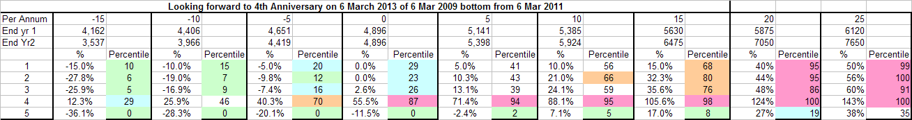
Based on this one would not expect growth of more than about 5 to 10% compound (which would keep most horizons performance within the central range of their percentiles. However if one expects that recoveries generally lead to higher percentile performance before a significant market fall, then one might expect performance of around 15% pa resulting in horizons being in the moderately uncommon range (of 65th to 80th percentile for 1, 2, 3 and 4 year rolling returns). The dramatic 1 year recovery from the bottom will be reflected as a very uncommon 4 year performance, while the 5 year performance will still be uncommonly low because it still contains part of the 2008 crash. This is not a prediction, just an analysis of what is likely and unlikely. Watching other indicators of market tops such as yield curve inversion, rising industrial stocks, reduced production, short moving averages crossing below long ones, PE ratios becoming uncommonly high, PE ratios being more than say 1.5 times the inverse of the 10 year bond yield, Shiller's PE 10 exceeding 20, increased fiscal austerity is also necessary to help determine when to rebalance away from equities.
Percentile Performance at Tops
Let's look at each of the major market tops and see what was the percentile performance for each of the 5 time horizons.

1. A 61% rise from the bottom is higher than the median and about average
2. The 2 year performance of 38% is up about the 80th percentile
3. At 2.1 years since the bottom, that is at the average period of time to the next top.
4. At 3.4 years since the peak of 2007, the length of this bull market is longer than both average and the median.
Overall, it looks more likely that we have not yet reached a major top.
Percentile Performance at Bottoms
Let's look now at each of the major market bottoms and see what was the percentile performance for each of the 5 time horizons.

Based on the fall since the last top and the 3 and 4 year performance the market still looks like a major bottom as at 5 April. On the other hand, based on the rise since the bottom and the 1 and 2 year performance the market looks like it has recovered away from the bottom.
Buy, Hold or Sell - Time to Rebalance?
Several US commentators and fund managers suggest that the US market is overvalued on many measures including Tobin Q, Shillers PE10, and Corporate Margins (such analysis seems less freely available for the Australian market but please me know if there are free sources for this information).
There are also concerns for the end of QE2, moves to fiscal austerity (a big move in UK and much of the EUR community and those that aspire to membership or wish to borrow from the IMF as a result of banking crises brought on by housing bubbles) and the possibility of rising inflation bringing rising interest rates as in China, India and the EUR community.
With US unemployment still very high at over 8% and the participation rate lower than historical highs, with US housing double dipping in many markets and capacity utilisation well below historical highs and with the yield curve very steep (not inverted as often happens before major crashes), there are many reasons to expect that US fiscal and monetary policy will remain expansionary to support both the real economy and some asset prices like commodities and the stock market (although wealth effect has little positive correlation to borrowing and spending). With Oil over USD110 and challenges to ruling autocrats in oil producing countries and with many commodities at long term highs (largely as a result of the USD at long term lows) some inflation seems likely in the US and consumers will face reduced discretionary consumption as gas/petrol prices rise given the relatively inelastic demand.
The question Richard Koo would ask is whether the US will contract fiscally, reducing private sector income and consumption and, one might expect although the correlation is not always strong, the stock market or will it recognise that in a balance sheet recession private deleveraging is saving which in the absence of changes in the international balance must represent public deficits if GDP is to be maintained.
The answer to Koo would depend largely on US politics. Most "respected" economists and commentators don't recognise that with a fiat currency the US government can adopt the Japanese solution to managing the fall out from the Tech (2000), housing and CRE (commercial real estate) bubbles and the Tea Party and many republicans and even progressives don't understand/accept modern monetary theory and treat the US government as an income and debt constrained "household" (or they don't think it can be explained to and accepted by the public/voters and so are using fear of deficits and debt to gain political advantage/avoid political loss).
While based on many factors the case can be made to remain 100% invested in the market, there are many factors as discussed above which suggest caution.
While it might be largely explained by the size of the fall in 2007-9, one thing which is striking is that when a major bottom occurs the median rise from the prior bottom is only 16% and the largest it has been in the 7 bottoms over 20 years since the 1987 bottom has been 35%, not including the current recovery which has seen a rise of 61% from the 2009 bottom. On this basis it is possibly the time to rebalance a substantial part of your portfolio away from stocks and in favour of short term cash (possibly using bank and credit union "special" term deposit deals) on the basis that even if you miss some proportion of the upside, there is a very good chance you can buy back in at a lower index value and, after deducting interest earned on the proportion switched, the stock market returns, if any, lost by switching part to cash after a recovery of over 2 years have, since the 1987 bottom, been small ( I hope to do more work on this for a future article). You will then have a chance to rebalance in favour of equities near a bottom and ride the next recovery.
The chart of Percentile Performance at Major Bottoms (above) will help you with bottom picking and could be used in conjunction with eg 30 and 90 day moving averages or similar (eg buy when the 30 day rises above the 90 day after a 20% fall.)
A Note on Currency
Remember that Private = Goverment + International for a given level of GDP. This is relevant not only to the need for expansionary fiscal policy during private sector deleveraging (Koo), but also to possible strategies to improve employment and capacity utilisation through currency devaluation, which also leads to changes in USD profits for US multinationals.
Countries with low capacity utilisation could theoretically be expected to export their way out of trouble by lowering interest rates along the curve through QE, causing a weakening currency and stimulating demand for domestic production by making imported goods more expensive.
Clearly not every country can export it's way out of trouble at once. Because of pegging to the US dollar by many countries including China, the US might be considered very unlikely to be able to export its way out of trouble. Australia is suffering from the Dutch Disease. It's high currency resulting largely from high commodity prices, comparatively high short and medium term interst rates and its low level of government (but not private) debt is rendering it's import competing businesses outside of mining much less competitive and reducing the value in AUD of profits earnt offshore. Conversely the US profits of multi nationals are being helped by the fall in the value of the USD against some currencies.
More sophisticated investors might like to consider returns of various markets benchmarked against a single currency. For example, the return to AUD investors has had two components. The currency strengthening to USD105 and the rise in the All Ords. The US investor has, in EUR and Dollar Index terms, had part of the US stock market performance offset by losses in the USD.
For Australian investors there is some uncertainty about the capacity of China (and India) to maintain it's growth without inflation which could lead to falls in commodity prices unless any slowing in domestic investment and consumption is offset by growth in the export sector as a result of eg US recovery extending to "Main Street".
Any international fall in markets would likely be accompanied by a fall in production, commodity demand and prices and the AUD. In March 2009 the All Ords was down almost 80% in USD terms compared to over 50% in AUD terms. Australian investors rebalancing from the All Ords could consider foreign currency denominated assets including short term deposits, but this exposes the investor to currency losses as well as gains. If a clear likely top is identified a la 2007, (long bull run, all time horizon performances in high percentiles) then a switch to eg USD or German medium to long term bonds could be very rewarding. See my earlier article: Currency and Diversification Impacts on Investment Returns to Australian Investors for full analysis.
ETF's (Exchange Traded Funds) based on regions, sectors or commodities can be used to diversify on an unhedged basis using either the US or Australian markets. Care should be taken to understand the impacts of different tax laws including the benefits to Australian investors of dividend imputation when invested in Australian stocks, and superannuation laws and taxation where relevant.
This blog is for informational and educational purposes only and does not represent investment advice.
Some sources of information and hat tips for commentary and analysis or leads to same include:
John Hussman - http://www.hussmanfunds.com/weeklyMarketComment.html
Adam Butler - http://www.butlerphilbrick.com/CaseStudies.html
Doug Short - http://www.dshort.com/
Calculated Risk - http://www.calculatedriskblog.com/
Paper Economy - http://paper-money.blogspot.com/
Pragmatic Capitalist - http://pragcap.com/
Bill Mitchell - http://bilbo.economicoutlook.net/blog/
Steve Keen - http://www.debtdeflation.com/blogs/
Business insider - http://www.businessinsider.com/