Thursday, March 1, 2012

Dangers in Periodic Growth Measures - But the Medium Term Outlook Could Be OK

As we approach the 3rd anniversary of the 6 March 2009 bottom of the Australian All Ordinaries let's look at actual and projected growth for the All Ords.

Consider the following tables. Each table includes a column which shows what percentile of performance since 1984 each period's performance falls within. For comparison, the right hand column shows the median percentile for each period taking into account all tops in the All Ordinaries since 1984. The performance which might cause concern that we are near a market top is highlighted red in the percentile column. We will see how it advances year by year because of the change in the market levels which are falling out of periodic performances as time goes by.

At 6 March 2012 if the market is at about present levels (I have assumed 4400):


All Ords 4400 6/03/2012 Med Top
Perf Over % Percentile Percentile
1 year -10% 14 68
2 years -8% 16 83
3 Years 40% 76 77
4 years -20% 4 54
5 years -23% 0 79

Three year growth looks quite high in percentile terms. You might feel that, based on that measure, the market shouldn't go much higher. But on each other period the market is at quite low levels of growth and could easily be higher.

Also, what will happen to 3 year performance after 6 March 2012 if the market stays at about current levels? It will fall significantly!

But, 4 year performance which is presently near all time lows in percentile terms will start to increase significantly!

This happens as the relatively high market levels of 2007 and early 2008 fall out of the calculation and are replaced by the lower values of the current market, even if the All Ords stays around current levels.

So lets look at a scenario for 6 March 2013. We will see that 3 year performance goes back to well below the mean (50th percentile) at 16th percentile, whereas 4 year performance is now in the 65th percentile and well above the median 4 year performance for market tops since 1984.


All Ords 4400 6/03/2013 Med Top
Perf Over % Percentile Percentile
1 year 0% 29 68
2 years -10% 12 83
3 Years -8% 16 77
4 years 40% 65 54
5 years -20% 0 79

So now we can look at 2014 and 2015 and you will see how the percentile performance would continue to change each year. These tables continue to use 4400 (around current market values, rounded for convenience) at 6 March 2014 and 2015.

First 2014:

All Ords 4400 6/03/2014 Med Top
Perf Over % Percentile Percentile
1 year 0% 29 68
2 years 0% 25 83
3 Years -10% 14 77
4 years -8% 12 54
5 years 40% 38 79


And now 2015:

All Ords 4400 6/03/2015 Med Top
Perf Over % Percentile Percentile
1 year 0% 29 68
2 years 0% 25 83
3 Years 0% 22 77
4 years -10% 9 54
5 years -8% 1 79

 It can be seen that by 6 March 2015 without further growth the All Ords would be well below median values for each performance measurement period, would be near all time lows in growth percentiles for 4 and 5 years and dramatically below the median levels of performance for each period at prior market tops since 1984.

In fact the All Ords could grow by 12% pa for each of the next 3 years (from my assumed level of 4400 at 6 March 2012) and all performance measurement periods would be below the median levels for the market tops since 1984. In the table below the rows are in descending order from 1 to 5 year performance. The top half of the table is percentage increase over the relevant period of years. The bottom half of the table shows the percentile since 1984 into which that performance falls, again in descending order from 1 to 5 years. Every percentile in 2015 is less than the median percentile for that period of performance for the market tops from 1984 to February 2012.


6/03/2013 6/03/2014 6/03/2015 Med Top
12% 12% 12% 15%
1% 25% 25% 37%
3% 13% 40% 41%
57% 16% 26% 33%
-11% 75% 30% 70%


61 61 61 68
26 70 70 83
26 38 77 77
83 33 44 54
0 85 26 79

The moral of the story is that after booms and busts, when looking at relative performance compared to historical records, care has to be taken to ensure an understanding of what is falling out of the periods as well as what is coming into the periods from recent changes.

This is not a prediction of market rises for a particular length of time or even at all. It is just to ensure that we understand how the performance of the market over time periods is affected by the index values falling out of the period being examined. It also gives some idea of what could be possible if past patterns were to repeat, but past performance is no guide to future performance. Remember Japan and look at China and consider our private debt levels.

Since 1985, the longest period of negative 1 year growth being maintained appears to be from January 2008 to September 2009. The shortest significant periods seem to last about 12 months. But to get back to 0 growth over 1 year the market has to have turned up from the lows which would seem likely to have occurred by 6 months after 1 year growth first went negative. If the 1 year growth went negative in around July 2011, then by December 2011 you would be expecting to see an upturn in the market, with 1 year growth getting back to positive by July 2012.

There are a lot of things indicating that unless this time is different, the current upturn is likely to be sustained for a year or two.
1. Coppock is looking like turning up from below 0 and has been down to 13th percentile
2. 1 year performance has been negative for almost 9 months and has been down to 14th percentile
3. 2 year performance has been down to the 8th percentile, currently 13th percentile
4. Market has been to a median bottom based on various measures such as percentage fall of 20%, sum of growth over 1 & 2 and over 1, 2 & 3 years and has recovered more than 10%
5. 10, 30, 50 and 100 day moving averages have all turned up.
6. The 3 quarter market performance compared to a long term average has started increase. It rarely breaks down again until getting well into positive territory (ie getting 3 quarters at significantly above 7% pa increase in All Ords)
7. RBA has moved away from forecast tightening to having eased and being aware of the contractions in the real, non-resource, high employment sectors of the economy.

So statistically speaking the probability is for the All Ords to rise over the medium term (unless we were to have a performance like Japan where the performances and percentile cureves changed dramatically during the unwinding of the 1990's bubble.)

The Caveats to this are:
1. Things can always get worse as they did leading into 1991 which fell back almost to 1987 lows.
2. China could have a hard landing
3. Greece will still probably default eventually and Portugal and Ireland are not out of the woods.
4. There are still some calls out for a US recession based on "ensembles" of data (ignoring monetary data which has been grossly distorted by FED intervention, although Hussman seems to have let his timeframe drift out from 8 weeks to 18 months and ECRI seem to have gone very quiet. The Conference Board revised its Leading Indicator series but it suggests that the danger may have passed.
5. Oil prices are back near recent highs and there is uncertainty regarding Iran supply.
6. There is virtually no growth in Australian employment and this often leads to recession, but the savings rate seems to have stopped rising so as incomes increase even at low rates it might now flow into spending.

Conclusions

Assigning probabilities I would say 70% chance of a reasonable period of growth continuing for up to 1 to 2 years, with the chance increasing to 85% if we get a positive Coppock signal and the market breaks out above previous resistance around 4500. The Coppock did not give a signal at the end of February, 2012.

12% pa growth from current levels for the next 3 years would not look extraordinary for 1,2 or 3 years, although the 4 and 5 year growths would look quite high in separate years as explained above.

An All Ords of 5300 in 2015 would look quite reasonable on most "growth over period" measures.

Whether that growth would be evenly distributed or would be higher in currently depressed sectors is a matter of conjecture.


Thursday, February 16, 2012

Without PE Re-rating There's Not Much Appreciation

The period from September 1974 to March 1992 was an incredible time to be a holder of the All Ordinaries.

This was the period after the first oil shock and during which stag/inflation was defeated.

The period was marked by the re-rating of PE ratios from 5.4 to 20.1. That PE re-rating drove huge increases in the value of the All Ordinaries.

When you compare that period to some others of equal length and to the period since June 2001 to now, you quickly see that when you strip out the period of the re-rating of PE's, capital appreciation from the All Ords is very poor compared to commonly quoted numbers like 7% pa.. The capital appreciation shown does not include dividends, which would add a few percent onto the return (and really should not be ignored, but are for the purposes of this comparison).

The table below shows the rates of return after indexing each period to 100 at the start date of that period.


Start Date Sep-1974 Sep-1994 Sep-1961 Jun-2001
End Date Mar-1992 Mar-2012 Jun-1979 Mar-2012
Start 100 100 100 100
End 815 210 197 124
N Per 70 70 70 43
Rate / period 3.04% 1.05% 0.95% 0.51%
Nom Rate PA 12.2% 4.2% 3.9% 2.0%

We can see the same thing graphically which brings the point home more sharply. The sustained dramatic capital appreciation occurred only during the period of re-rating of PE's as inflation was defeated.

We can also see the 2004 - 2007 boom quite clearly in the chart below ( at period 41 to 55 in red and 12 to 26 in yellow) and ask ourselves why we thought it would never end, particulalry when we look at consistency of 10 year government interest rates over the period and the lack of any real boom in GDP growth.

The only consolation we can take is that over the coming 27 periods we could see a higher rate of capital appreciation of 7.1% to the end of 2018 if we are to get to the 200 indexed value seen for the other two 70 quarter periods (not including the re-rating period) in the chart below.


The questions then are,
1. "What sort of appreciation ought we expect from buy and hold in the absence or a significant re-rating of PEs?"
2. "Are we likely to see a re-rating of PEs and if so which way?"

Long term bond yields are presently low compared to earnings yields on the All Ords. If interest rates go down and stay down then a re-rating is possible and even likely over a few years. If interest rates come back up, then there could be big losers in bonds and possibly in stocks.

Overarching all of this is "How long will the Balance Sheet Recession last?"


Tuesday, February 14, 2012

Mid Feb Coppock, Long MACD, Modified Turtle and Dashboard Update

My long term MACD indicators are saying BUY for the major markets I watch, The All Ords moving averages directions and crossovers other than 50 > 200 are saying BUY, but the traditional Coppock is saying "not yet" for the markets I follow (although the All Ords is neutral mid month). My big reservation for the All Ords is that it may still be range bound between 3900 and 4500 and my modified Turtle indicator has not signalled a buy, although it is set for few whipsaws. It requires a breakout above 4450 but having been whipsawn once I am looking at 4500.


Coppock Dashboard (including MACDs, using close US ETF as a proxy when looking at USD values).


Note that I have added a percentiles row in the Coppock Table. 4 of the 6 markets listed have Coppock scores in the lowest 30% in the history I have. Japan is unusual in that it has been in a Secular decline for over 20 years with progressively lower ending bear markets, so its Coppock score's relatively high percentile reflects that. one day Japan might move into a secular bull market, although its demographics are against it.

All Ords Dashboard including Coppock, Modified Turtle and Median Bottom Comparison (1 & 2 Yr growth).


Note that other than Coppock, modified Turtle and 3 year growth rate everything looks BUY. I think the 50 > 200 cross is too subject to whipsawing to be a first indicator of a BUY or SELL, so I tend to discount it.

I note that we are still around a medium term bottom in terms of 1 and 2 year growth, but as we approach the 3 year anniversary of the March 2009 bottom the 3 year growth and its percentiles become more worrisome.

At 4400 it would be 40% and 81st percentile.

At 4900 it would be 58% and 91st percentile.

As we pass the 3rd anniversary then it is possible that even if the All Ords stays relatively stable 3 year growth will moderate as the lows fall out of the period, but 4 year growth may increase as the 2008 highs fall out of the 4 year period. Remember, periodic growth figures are as much about what has fallen out of the start of the period as about the recent changes in the market. both ends of the period count.

Modified Turtle Says Not Yet

Because we are below the previous recent peaks around the 4400 mark there is a real risk of being whipsawn by a range trading market. The modified Turtle indicators are set to minimise risk of being whipsawn.


My Modified Turltle is not a guarantee against whipsawing, but it is set to minimise them, but at the cost of missing some rise before buying and enduring some fall before selling so any whipsaw will be costly. The BUY and SELL are 8.6% apart at present.

Fundamentals, GDP, Emerging Markets and Comparative Bond Yields not considered.


I have not considered fundamentals, fiscal settings or relationships with GDP and Bond Yield in any detail in this post. This post is primarily about market timing indicators.

 I remain concerned about recession risk in Australia. My indicator is YOY employment growth being flat and trending down, a strongly inverted yield curve 3M to 3Yr and 3M to 10Yr and AUD still very high and recently increasing hurting manufacturing and tourism.

All Ords growth compared to GDP growth is at a relatively low level, even if the extraordinary growth in the All Ords from '74 to '87 as PE ratios adjusted from 5.4 to 20.1 is discounted.

10 Year Bond yields are reflecting a strong preference for Government Bonds over Shares. This could lead to a PE re-rating over time, or could indicate danger for bond prices if there were no recession and emerging inflation leading to rises in rates across the yield curve or a liquidity squeeze because of our dependence on offshore savings to finance our debt. I regard inflation as unlikely given Australian fiscal policy of striving for surplus next year, but the squeeze on offshore funding is already evident from the recent bank rises in variable mortgage rates.

My article on the Cream Portfolio shows that a mix of 6 Emerging Markets have been very good over 10 years and seem very consistent and still trending well.

If the trend is your friend, then subject to the whipsawing and range trading caveat, its now, when Coppock turns up or at over 4500.

Maybe 1/3, 1/3, 1/3 is something to consider.

Not Financial Advice

As always, this is not financial advice, just my thoughts on investing which may be totally inappropriate for other people's circumstances and which change with changing markets. While history may rhyme, it may not be a good guide to the future.

Saturday, February 11, 2012

The Cream Portfolio

Give me the Cream
The Cream Portfolio comes in two flavours, Developed and Emerging. Each flavour has a special recipe.

Emerging Cream has a sweetness in excess of 3, while Developed Cream is much less sweet at only a bit over 1. (Average the top 6 scores in the far right column of each of the tables below to see what I mean.)

I sure wish I'd have seen the recipe for Emerging Cream 10 years ago!

What are the Recipes?

Developed Cream is made from:
1. New Zealand
2. USA
3 Ireland
4. Australia
5. Singapore
6. United Kingdom

Emerging Cream is made from:
1. Indonesia
2. Phillipines
3. Thailand
4. Colombia
5. Peru
6. South Africa

Can I improvise?
All good cooks improvise. You can have Emerging Cream with Developed Cream, or you can leave out or add ingredients. Or you could choose to mix up an entirely different batch, but it might not be cream, although it might become cream later. You could leave out the last 1 or two ingredients in each flavor, but that would reduce the diversification and increase the risk. You could add more ingredients and increase the diversification, and probably reduce the "risk"and probably dilute the return. You could make a Mixed Cream flavor with some ingredients from each recipe.

Show me the Money!

Here are two charts that show you the money about the Cream Portfolio.
Developed Cream

Emerging Cream

Look at the returns in the Emerging Cream. It has certainly been a lot sweeter than Developed Cream!

Methodology

Making the Cream Portfolio is based on analysis of the best performing markets in USD terms over a number of different periods weighted towards following recent trends.

The data comes from MSCI Barra Performance tables for Countries.
http://www.mscibarra.com/legal/index_data_additional_terms_of_use.html?/products/indices/global_equity_indices/gimi/stdindex/performance.html

I have weighted 3 Month To Date, 1 Year to Date and 3 Year To Date performance with multiples of 10, 7.5 and 5, then calculated a total. Then I have ranked each of the tables by the total score.

In each time period in each table I have coloured the better performances in Green and the worst ones in Red.

From the consistency of the Green and Red you can see that some countries know how to make the stock market go up or are blessed with the right resource mix and some don't.

Maybe the terrible performances of eg the EMU countries will revert. If they do it will be picked up through the heavier weightings of  3MTD and 1YTD compared to 3YTD.

You can get the data for free and make your own version and play wioth different weightings, but you can see from the consistency of the colours across time that it won't change the rankings dramatically.

Every 3 months (or more or less frequently if you like) you can redo the exercise and adapt the recipe.

A Few Caveats
This is stock market cream. Sometimes stock market cream can go sour virtually over night, like in 1987. Sometimes it goes sour slowly but still goes very sour, like in 2008. You might decide that too much stockmarket cream is not good for you and add some sort of Long Term Bond Cream to the mix. When you play with recipes sometimes you spoil them and wish you had stuck to the original. Nothing works all the time, but I was impressed by the historical consistency as well as the sweetness of both the Emerging Cream and Developed Cream. Finally recipes go out of favour and what was goo last year might not be good next year!


Thursday, January 26, 2012

Ask your financial planner this!

Here is a question to ask yourself, and your financial planner.

Should my equity correlated asset allocation be the same after a huge 5 years bull market as it is after a 30% fall in the equity market?

The top half of this graph is what the Australian All Ords performance was like when a major Australian Bank's financial planner recommended an asset allocation highly correlated to the stock market and including a proportion of geared equities.

The bottom half is what the All Ords performance is like today.

What proportion would you want in equities at each point in time? (Don't forget the old adage, "buy low, sell high"


In the top half, you can see that the market had performed incredibly well over 2, 3, 4 and 5 years, being better than 90% or historical performances for these lengths of time. The bull market had also been going significantly longer than the median length of all bull markets since 1984.

Is this a good time to have a very high proportion of assets switched to the stock market, or assets with a high correlation with the stock market, and into geared equities?

The bottom half of the graph is now. Any bull market has just started after a 20% drop in the market to 26 September 2011 bottom. Performance for 1, and 2 years is in the bottom 20% of scores and well below median performance for those periods since 1984. Performance over 4 and 5 years is in the bottom 1% of such performances since 1984. The 3 year performance is above average as it reflects the climb from near the deep bottom of 6 March 2009.


The chart above shows the historical performances over 1 to 5 year periods from 1985 to January 2012. It shows approximate dates of tops (red) and bottoms (green) by vertical lines. Tops occur when performance has been good for 3 (bright dark blue) or more years. Bottoms occur when performance has been very bad for 1 year (pink line).

When the market is down about 15% or more and is turning up, it is more likely to be a time to increase equity exposure than it is when the market has been going gangbusters for over 3 years and 3 (and maybe 4 and even 5) year performances are excellent.

This is something that ought be considered, among many others, when reviewing a proposed or existing equity correlated allocation of investments.

Monday, January 23, 2012

GDP Growth vs All Ords Growth

Updated 25, 26 January and 8 and 16 Feb, 2012
(8 Feb update looked at 1974 to 87 period of exceptional performance and added scattergrams of  changes in All Ords vschanges in GDP and changes in All Ords vs changes in 10 Year Bond Yields )
(16 Feb update just above the Scattergrams section, including the last table re All Ords and GDP (indexed from 1998) and the following paragraphs) 

Originally posted 22 January, 2012.

This is a post I am continuing to develop and which examines 3 primary questions.

1. What is the relationship between stock market growth and GDP growth?

2. Does the stock market growth have a high correlation with GDP growth?

3. Do changes in the relationship between GDP and the stock market allow timing of the market, at least in bubble recognition?

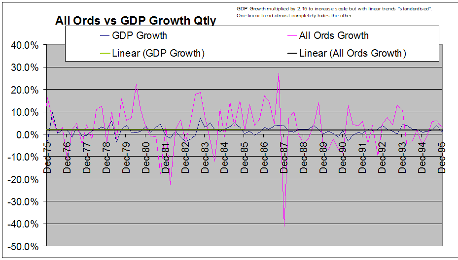
From looking at the data there is nothing obvious about a correlated pattern of timing on a quarterly basis of growth in GDP and growth in the stock market. (Click graphs for larger images.)


Seeing the lack of correlation on a quarter by quarter basis in the graph made me decide to check the degree of correlation over periods of different numbers of quarters using statistical methods.  The table below is the result of looking at all periods possible of the numbers of quarters shown over the period of  52 years from 1959 to 2011:


# of Qtrs 4 10 20 50 100
Ave RSQ 0.555 0.460 0.461 0.645 0.841
Median RSQ 0.638 0.468 0.450 0.754 0.888
Std Dev 0.348 0.326 0.320 0.278 0.124

The conclusion is that over short periods of say 1 to 5 years there is little correlation, and over long periods of say 30 to 50 years there is increasingly strong correlation.

That wasn't what I expected, so I continued to test different hypotheses with the data looking at relationships. It made me think of a post I had read about someone who modeled complex systems and who then looked at the relationship between stock market and GDP but more from looking at average relationships between the two.

 That lead me to ask myself, "What should the relative growth of equity be compared to the growth in GDP to provide an incentive for capital and business formation?"

My first guess, perhaps based on my unremembered modeller friend's work, was that equity should grow at a, say, 50% higher rate than GDP because this would provide people and businesses with a reward sufficiently greater than the mere passive growth in GDP so that there was a real incentive to take risk and borrow funds to form and grow businesses. So I modeled that using GDP data from the RBA statistical tables. It didn't make much sense as there seemed to be a dramatic change between 1983 and 1987.

In this first chart below I have multiplied All Ords growth each quarter by 0.6667 (same as dividing by 1.5) and subtracted GDP growth for that quarter. Clearly in the period to 1978 or so the All Ord quarterly growth didn't get  near 1.5 times GDP growth, while say 1978 to 1987 had a much higher ratio and from 1988 to end 2011 the All Ords grew at a bit better than 1.5 times GDP growth (based on eyeballing the slope of the trends during those periods.


I played with the ratio to get the long term growth of each of the All Ords and GDP equal from 1959 to 9/2012. That showed a lower than average proportion of equity growth to GDP growth to the mid 70's, a very much higher than average ratio from 1974 to 1987, relative stability from 1988 to 2001, an increasing ratio from 2002 to 2007 and a falling average ratio from 2007 to end 2011. The graph below illustrates these changes.


I did notice though that the peaks and troughs in stock market performance were fairly obvious. (I note that:
1. the period of change corresponds with the period during which inflation was defeated with interest rates lagging deflation down over time till inflation entered the 2 to 3% range now targeted
2. from my reading of Steve Keen's work that the period of 1986 to 2007 is the period of dramatic growth in household and total debt in Australia , both as percentages of GDP, and
3. that the period from about 1990 to 2007 saw the skewing of income shares in favour of the top 10% and even more so the top 1% on some countries)

In looking at using different ratios of equity growth to GDP growth I noticed that a ratio of 1 made sense of the period from 1959 to the late 70's.


I also worked out that a ratio of  almost 2 (1.96 to be precise) made sense from 1987 to 2011. Note the peaks of 87 and 2007 are aligned as are the bottoms of 1991 and 2009.


The ratio that made sense of the period from 1978 to 1987 was 6.6 times! This was a period of huge adjustment.

With a ratio of 1.5, equity holders increase their wealth exponentially unless gains and/or wealth (I need to give that more thought) are subject to progressive taxation. At a ratio of 1 I expect that equity holders get more wealthy far more slowly, unless there are taxation concessions for capital gains.

Notes on 68 to74 and 74 to 87
1974 was a very bad year for the stock market.

There are 3 major things to remember about 1973 and 1974:
1. The first oil shock occurred in 1973. Oil increased from about USD 15 to USD 100 per barrel in 2007 USD, a 600% rise.
2. From Feb 74 to Sept 74 the PE of the Australian All Ords fell from 10.7x to 5.4x
3. There was an inverted yield curve steepening for the same period. 90 day rates increased to 1.32 times 10 year government bond rates. (In March 2009 they were only 0.7 of the 10 year rate).
4. From 1960 to 74 the stockmarket grew at only the same rate as the GDP.

The period from September 1974 to September 1987 was the "golden years" of the Australian stock market.

1. This was in spite of oil prices continuing to rise significantly.
2. The yield curve became more normal with 90 day rates falling to 0.95 of 10year rates
3. The huge difference was that PE ratio.s rose from 5.4 times to 21.1 times. This dramatic re-rating would, all other things remaining equal, cause an increase from an opening indexed amount of 100 to 390.
4. In addition to the dramatic change in PE ratios, GDP grew by 48% over the same period, leveraging the impact of the rise in PE ratios.

1987 was then a very bad year for the market as it fell 50% in the matter of a few weeks. Looking back with hindsight we should not have been surprised as the exponential rise of the preceding few years was simply incredible and not sustainable. Depending on exact choices of starting and finishing months the All Ords has grown about 1.9 times as fast as GDP from 1987 to 2012.

In 2007 we had endured a sustained increase in crude oil prices back to over $100 in 2007 USD terms, similar to the 1973 first oil shock and the stock market crashed again.

In conclusion, the re-rating of PE's as governments proved to markets that they were going to return to a low inflation, low interest rate world was the major thing giving rise to the golden years of Australian stock markets, assisted by GDP growth.

Another approach

I thought I might look backwards and forwards using stable periods for indexing and trend determination. I chose December 1998 as the base date for indexing to make GDP equal to the All Ords on an indexed basis. I chose the date because it was where 10 year government bonds first approached 5.0%, a rate they have have been around from that date to date, although the average over the period is 5.59 and the yield was 3.67% at 31 Dec 2011.

I used Excel to calculate the growth rates of GDP and the All Ords from that Dec 98 to Sept 2011:


GDP All Ords
Start date Dec-1998 Dec-1998
Start value 230535 2813
10YGB 5.03% 5.03%
End Date Sep-2011 Sep-2011
Periods 51 51
Periods pa 4 4
End Value 335767 4070
10 Year bond 4.22% 4.22%
Rate pp 0.74% 0.73%
Rate pa nom 2.96% 2.91%
Relatiivity 1 0.982
Inverse 1.018 1

We have had a period of 51 quarters where GDP grew marginally faster than the All Ordinaries, which is very similar to the period of the 60's and early 70"s before there was dramatic growth as inflation and interest rates fell.

This can be shown graphically.


By looking at the All Ords against GDP we can again see how obvious the mini-bubbles of 1987 and 2007 were. When looking at the chart, remember that interest rates were in a very substantial long term down trend before 1998, so the real focus on this chart is post Dec 1998. The implication from looking at the chart is that while nothing is certain, and corrections can overshoot to the downside, at present levels, absent a recession the stockmarket could reasonably be expected to grow in capital value at the rate of GDP growth, say 3% plus give a running yield, which I understand is normally in the order of about 2% of GDP. We can also see that over the long term the average rate of growth in the stock market has been higher than the GDP growth rate. The fall in Bond Yields should also help drive up PE ratio of stocks.

The one thing that looks quite clear from the chart above is that the excessive prices (based on comparative GDP growth) of 2005-7 have been rectified by a combination of GDP growth and price stock falls. Stocks are now in a fair value range, subject to no major change to GDP growth and no major realignment of interest rates, or other major shock like a disorderly default of Greece.

As I write the recent rises in the All Ords have changed the growth rate over the period from Dec 1998 to 1.1 times the rate of growth of GDP (assuming trend growth of GDP from September), still well below the average since 1960.

The diagram below shows more clearly the relationship between GDP and the All Ordinaries since December 1998. 


It seems that bottom and top picking might also be assisted by looking at the relative growth of the All Ordinaries compared to GDP, but with an awareness that if there is a transition in rates of infaltion/deflation or interest rates needed to sustain target inflation, then there might be a realignment of PE ratios over a period of years if those new interest rates are sustained. This could be happening now in the US and non-PIIGS europe. By looking at the difference in the exchange rates in the text box, but not reflected in the chart above, we see that the relative profit for Australian investors has been  against USD investors. This is also true against GBP, EUR and many other currencies to greater and lesser degrees, making us ask the question "Is a good time to diversify internationally to Emerging Cream?" (see later article).

Scatter diagrams: GDP and 10 years bonds vs the All Ords

On a period by period basis there is relatively little relationship between the All Ords and either of GDP or 10 year bond rates.


I was expecting that the chart above would show a pattern that correlated falls in the 10 year bond rate with rises in the All Ords, and rises in the 10 year bond rate with falls in the All Ords. It is not the case within the single period of 1 quarter.

I was expecting that large falls in the All Ords would have been correlated with falls in GDP, but virtuall all quarters with lower GDP than last quarter showed a rise in the All Ords. There did not seem to be a likelhood of a greater correlation by adopting say a 1 quarter lag, at least from eyeballing the columns of data.

The change in the All Ords is not highly correlated with changes in either GDP or 10 year bond yields for any single quarter or for quarters generally..


Looking Forward

The question now is whether the ratio which equalises GDP growth rates and the All Ords growth rate has  changed or the All Ords growth is merely at a temporary low compared to the GDP growth.

If the last 4 years has seen a change, it is to a rate of 6.6 times again, but this time to reduce the relative size of losses in the stock market compared to growing GDP! (In the period 78 to 87 it was a measure of relative outperformance of the stock market compared to GDP, not underperformance as it is now.)

Alternate theses are that
1. GDP is set to fall significantly and the stock market has anticipated it, (given the obvious costs of austerity in unemployment and social upheaval I can't see this being a sustained outcome for a country with a fiat currency.)
2. the relative reward to equity vs labour will be reduced and profits and the stock market will fall accordingly or has already anticipated the fall in share of revenues going to equity, or that
3. the stock market, having shrunk compared to GDP since end 2007, will shortly resume its relationship of growing at almost twice the rate of GDP.
4. Some combination of the above.

It is highly unlikely that the Australian stock market will grow at less than the rate of GDP growth for more than 4 quarters (see discussion of correlation and R-squared near the top of the article and relative ratio of growth in 70's being 1), although Japan shows that is possible after a dramatic bubble even over 20 years previously in an economy facing demographic headwinds.

Note re mathematical analysis:
I expect I might need to examine the periods of 1959 to the late 70's completely separately to the period of 1987 to 2008 or 2012 so that the first period is not affecting the second. Intuitively I think that the trend from 1987 to 2012 being essentially horizontal on the graph is sufficient, but I need to prove this to myself with further work when the spirit moves me!

Tuesday, January 10, 2012

Some "Odds" to Consider - Recent Medium Term Growth

The takeaways from this article are:
1. It is likely a good buying opportunity based on an expectation (which may be disappointed) that the future will rhyme with the past for the All Ords
2. The time (selected with the benefit of hindsight) to consider selling the All Ords in the past has been when the sum of the 1 and 2 year performance of the All Ords has been positive, generally when it has exceeded at least 40%, not when it has been lower than negative 25% as it is now, other than for a total of about 8 months out of the last 25 years.

We are often being told that the stock market is up or down x% this year, and we know that performance fluctuates, sometimes dramatically.

We have probably also heard of the concept of mean reversion. When something grows dramatically for a long time, it will probably grow slowly or fall for a long time after that so that long term growth reverts to the previous long term average growth, or overshoots to be below the long term average.

We know that market peaks always occur when growth has been strong, and bottoms always occur when the market has had a substantial fall.

So, unless we have had such a bubble that we must have an incredible bust to get back to normality, (ie we are "turning Japanese") then we could look at medium term performance of the All Ordinaries as an indicator of the odds that it will change direction. If it is at a very high level of 1 and 2 year performance, or 1, 2 and 3 year performance, then we would expect that the odds of a downturn are increasing, while if the performance over 1, 2 and 3 years has been woeful, we might, if we think that the future at least rhymes with the past in this regard, think that the chances of some good performance must be increasing.

Remember that some like Steve Keen have pointed out that Australia has had a huge increase in private debt that has funded our consumption and investment boom, that the Reserve Bank charts show credit growth way below recent averages and household saving way above recent averages and that recent house price falls will be constraining credit availability and appetite for many.

We also know that there are recession calls generally accepted for much of Europe in H1 2012 and some credible, but not generally accepted, calls for a US recession in H1 2012, China has had a continuously falling stockmarket for many months and has had unsustainable property price appreciation and infrastructure investment since the bottom in 2009 when massive stimulus was introduced.

Having said that, lets look at past percentile performance over medium terms to see whether the current performance is unlikely to deteriorate based on past performance.

To do this I have looked at adding together a number of performance measures from the 2 month, 1 year, 2 year and 3 year horizons. I didn't go longer because the average length of cyclical bear markets since 1984 has always been less than 15 months and as you go longer than 3 years you are sometimes covering multiple cycles. The median length of time between peaks has been just over 3 years.


The graph above shows the percentile outcomes of adding together 2 Month, 1 Year and 2 Year performance. About 50% of the time the result is better than 40 eg 2M = 5, 1Y =15 and 2Y =20. The result today is -31.7%. Such a bad result has happened only about 6% of the time since 1984. Similarly I looked at the totals for 1 and 2 year performance and for 1, 2 and 3 year performance. All are in the bottom 20% of outcomes. So one could suggest that if the future rhymes with the past there is say an 80 to 90% chance that the market will continue to stage a possibly somewhat volatile recovery from the levels of 26 September 2011.

We also: 
1.  know there is a small history that indicates that performance can deteriorate significantly - just look at the -130% total in percentile 1 of the chart above
2.  recognise when we think about it that if the All Ords stayed at its current level for 2 years that the total of 1 Yr + 2 Yr performance would increase to be 0 at the end of those 2 years
3.  recognise when we think about it, that the averages over fixed length periods moving forward are as much about the old scores that are dropping out of the average as they are about future performance.

Let's look at the history of this measure since 1 July 1987 for the Sum of 1Yr + 2 Yr Growth .


Virtually all of the worse than current scores occurred during either of 2 periods of extreme recession or the exit from extreme recession:
1. 4 months in 1990/91, or
2. September 08 to September 09

For a part of each of those periods  the All Ords had started to recover from its lows and the sum of the averages was in catchup mode as higher levels at the start of the period covered fell out of the averages.

One amazing  observation is that at the immediate bottom of the September 1987 crash, the All Ords still had a positive 1 and 2 year performance sum, such had been the incredible "blow off" top in 1987. It might be thought that, given we have had a long and dramatic period of underperformance in 2008/9, the excesses of 2006/7 have been exorcised.

This article is presented as information about past performance and for general financial education and is not advice or a recommendation to take any action.